A Brand New Year. A Brand New Logo!
Metro, we are excited to ring in the new year with a completely brand new look for Metro Community Church - behold our new Metro logo!
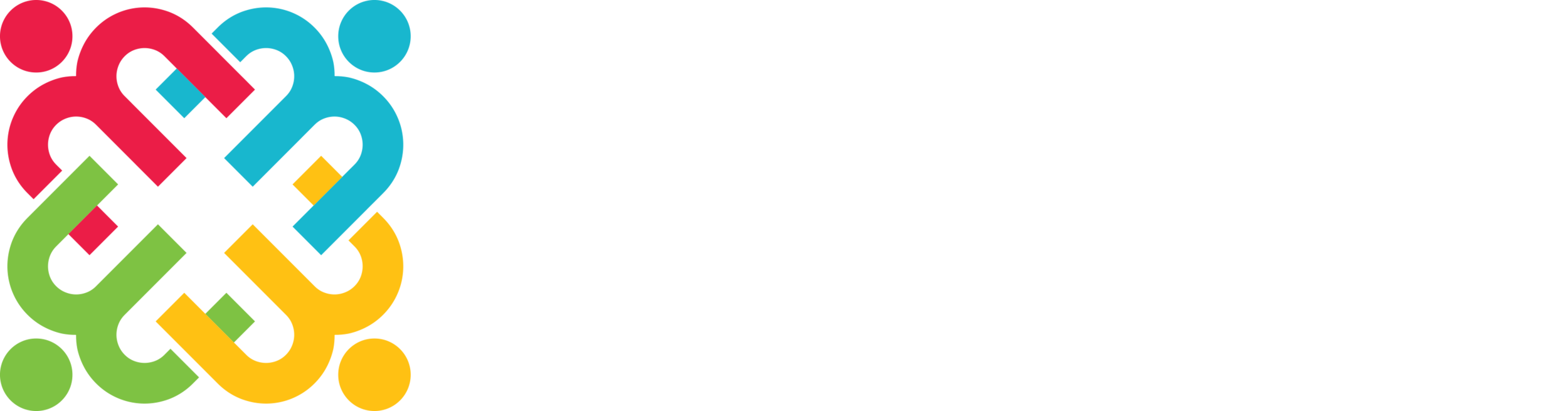
After many years of discussing a re-design of our Metro logo to something more fresh and - more importantly - meaningful, it is finally here! To give you a better understanding of why we felt that this design was the right design for us, here is a brief breakdown of all of the main design features that make up the new logo...
M is for Metro
As you can plainly see from the logo - the symbol is comprised of four 'm's overlapping each other to create an interesting geometric pattern. M is for Metro. Simple enough. Moving on!
Metro is about people
Directly above each 'm' is a solid circle that transforms the 'm's in to people, arms linked - a community! In this particular version of the logo, we have four colors representing our community - red, blue yellow and green. While the colors of our logo will likely change from time to time and season to season, they represent that Metro is a multiethnic church that welcomes all people from all cultural backgrounds.
Metro is about God
Just as each circle represents the heads of our a community, the circle in the center of the image represents the "head" of our church - God who is colorless, body-less, but the One that our faith and our community revolves around and is anchored to.
Metro believes that Jesus conquered the grave
Perhaps a little more subtle in the design is the cross (or 'x') shape that is formed from the middle leg of each 'm' converging towards the center circle. Traditionally, crosses in Christian symbology stand up straight. Our cross is tilted like an X, because ultimately the cross no longer stands - Jesus overcame death on the cross by resurrecting from the dead. The cross is broken, death has been defeated! Halleluah!
Metro is a Evangelical Covenant Church
While certainly not intentional during the design process, we realize that there is a similarity between our new logo and the Evangelical Covenant Church logo - that's totally ok! We actually like that it makes us feel like we are part of the same family as our denomination.
Metro is not Metro PCS!
One of the most common critiques that we received from our church members regarding our old logo was that it looked very similar to the Metro PCS (cellphone company) logo...except maybe a little more squished together. For our new logo, we have a completely new font - very clean, very modern and no longer cramped together. We hope that this new, clean-looking typeset will stand the test of time.
Two visual elements that we did keep from the previous logo is that we still have a crooked 'e' in the word 'metro'; and "community church" is positioned directly underneath the 'metro' as well. While, these might seem trivial and not worth mentioning, it does lend itself a slight visual consistency to the old logo that makes the new logo feel somewhat familiar, even if it is a complete re-design.
Metro. Enjoy!
So there it is - our new logo! We are very excited to have a symbol that we feel better represents us as a church - a symbol that you can get excited about, but also a symbol that may peak the curiosity of people outside of Metro, as we produce promotional materials and swag for our ministries etc.
Of course, you will still see our old logo around and about, but please bare with us as we slowly, but surely update all of our signs, swag and other Metro-related stuff with our new, fresh image.
Enjoy!